Historgrams and Overlayed Normal Curves in Excel
Now we can calculate different this by simply developing formula (some of them are not must !)
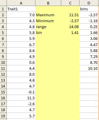
Formula to calculate maximum [ value in C2 cell above]
=MAX(A2:A101)
Formula to calculate minimum [value in C3 cell above ]
=MIN(A2:A101)
The range can be calculated by subtracting Minimum from Maximum value [ value in C4 cell above]
If you want to create 10 bins, you can calculate bin interval by: [ value in C5 cell above]
= range /10
Now we can fill the bin column, where the first number is minimum and is increased by the bin interval specified above.
=(D2+$C$5)
Here C5 cell has bin interval. Now by just pasting formula down we can fill the bin interval.
Bin interval can also be just users own choice.
Plotting histogram:
(1) In Excel 2003:
We need to generate frequency table for bins stored. Let's just copy and paste the bins calculated in separate column (use paste special and paste values only). New column called frequency:
(1) Highlight the range of cells that are supposed to hold the frequency counts (L2:L11). These will be every Frequency Count cells next to the bin increments.
(2) Choose Insert, then Function, pick the Statistical Function category and scroll down in the box and choose FREQUENCY as the Function name. Now pick the Data_array and Bins_array range. See the range of the trait in A2:A101 Data_array column while Bins arrays is in K2:K11 cells. The click OK.

We are not done yet, we need to calculate the frequency down, in the frequency count cells. Please note that applying function (copying cell) here is a bit different. With Frequency cell highlighted K2:K11, click the on the FREQUENCY function into the formula bar ( =FREQUENCY(A2:A101,K2:K11)) and the apply the function by typing Control-Shift-Enter on a PC (type Command-Return on the Mac).

Now it will fill the frequency for each bin. Now we can use this to plot histogram. We can use bar plot, however, the the bin names should be converted as text like features, use and apply the following type of formula to all frequency cells by generating new cell freq1 column.
=(ROUND(K2, 1)&"")
Then we bin1 column and freq column to generate column (bar) plot as usual. You can change spacing between bars to make the bars look compact.

However in 2007 Excel provides more automated function to generate frequency table and histograms.
(B) In Excel 2007
The function histogram can be used to generate Bin and Empirical Frequency and generates a bar chart (histogram).
Click in the data analysis menu, click histogram. Enter input data range and Bin Range.
You can provide output range or select new worksheet or workbook. Click chart output to plot the histogram.

Now the Raw histogram is available, you can polish this in the way you like ! For example removing the gaps to make it compact.


Plotting the theoretical distribution (normal distribution curve):
To plot the theoretical normal distribution curve we need to specify mean and standard deviations. Unless we have known or assumed mean and standard deviation, we can simply calculated this from the sample we have, let's first determine mean, standard deviation. I do not want to go on theoretical side of what we should use as mean or standard deviation.
Formula for:
Mean for the trait 1
=AVERAGE(A2:A101)
When we have assumed or known population mean we can replace this value with the assumed or known population mean.
Standard deviation for trait 1
=STDEV(A2:A101)
When we have assumed or known population standard deviation we can replace this value with the assumed or known population standard deviation.
Formula to calculate maximum
=MAX(A2:A101)
When we have assumed or known population mean and standard deviation we can replace this value with a defined value: for example value of mean + 3*standard deviation gives us 99% area under curve. We can set slightly higher maximum than this may be mean + 3.1*standard deviation.
Formula to calculate minimum
=MIN(A2:A101)
When we have assumed or known population mean and standard deviation we can replace this value with a defined value: for example value of mean - 3*standard deviation gives us 99% area under curve. We can set slightly higher maximum than this may be mean - 3.1*standard deviation.
Number of samples used to calculate above mean and standard deviation (counting non-empty cells):
=COUNT(A2:A101)
interval bin cell here is for the normal curve. The higher numbers is recommended to produce smooth normal curve (more close to theoretical). Here we want to plot the curve between mean + or - 3 x Standard deviation and we want to supply 200 bins to create the smooth curve. Thus the bin becomes:
= ((F2+3*F1) - (F2-3*F1)) / 200
User can choose own bin value (usually should be small and relative to mean and sd of the data).
For value of X,
=(G1)
Then the following values will be increased by the bin interval calculated in G3 cell.
=(H2+$G$3)

Now we need to fill the theoretical frequency:
The formula for the first cell stand like the following, paste the formula down:
=NORMDIST(H2, $F$2,$F$1, FALSE )*$F$4
Here $F$4 stands for the total number of samples. $F$2 is mean and $F$1 standard deviation. If we want to plot distribution that is standardized (mean = 0, sd =1), then we do not need this term. Multiplying is important when overlaying over total number type histogram.
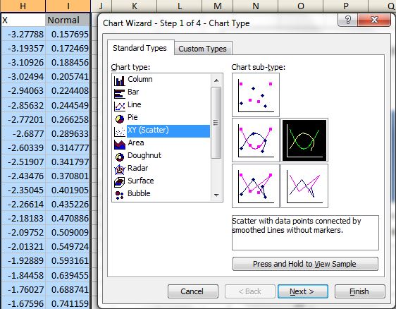
Now you can simply plot X, Y smoothed line plot:
We can modify this curve to fit the our needs and taste.

Overlay the normal curve over the histogram:
(a) Excel 2003.
Plot the normal distribution as discussed above. Now we need a trick to add the bars. Regular bar plot do not support continuous x and y values, so we need to use error bar. The only limitation here is bar size can not be increased to very large (in contrast to excel 2007).
(1) First draw the normal distribution curve
(2) Add new data to add the empirical bin interval and their frequency (to be used for bar plot). Right click on the plot to add the data to the plot. Under series, click add a new series. Then select X range where the bin (not bin1) is stored and frequency in Y value.

(3) Click the new line added and right click and format the series to add error bars to the plot. Put 100 under percentage. Click minus side of error ba.

Click OK and now we have got a way plot. Remove the curve of line by selecting line type non under format data series menu, that is not needed any more. We can click the bars and increase bar size to some extent.

(B) Using Excel 2007
The advantages of using excel 2007 is that we can change bar width to look more like histogram.
(1) Generate histogram as discussed above (we do not need a plot rather we need frequency distribution).
(2) Create the theortical curve as discussed above.
(2) In addition to the regular curve add a new curve using the bin and frequency. By adding data series to above plot. Select data and then add the series.

(3) Now click the recently added series (which is emperical density curve) and add error bars from the layout menu and then error bars and then select more error bar options. Then change the setting as of the following figure.

(4) Now you can delete the horizontal bars and increase the size of the bar, to make it look like histogram. Also you can supress the line by selecting no line opition.

Comments
Post a Comment