EXCEL :
BROKEN COLUMN AND BAR CHARTS
One of the requests boiled down to a mismatch of data needing to be displayed in the same chart. I.E. one of the series displayed in the chart would be very large compared to the others. Here is my sample data table:
 As you can see most of the data is below 1,000 units. The last series, (series 4) is just above 35,000 units. If you plot that data as a normal column chart you will get something like this:
 It’s almost impossible to read the values for Series 1-3, 4 & 5. What we need is a broken column chart. By using a broken column, you can see both the detail at the bottom of the scale and at the top. How is it done? You can download the worksheet I used here.
STEP 1 – WORK OUT WHAT YOU WANT THE CHART TO LOOK LIKE
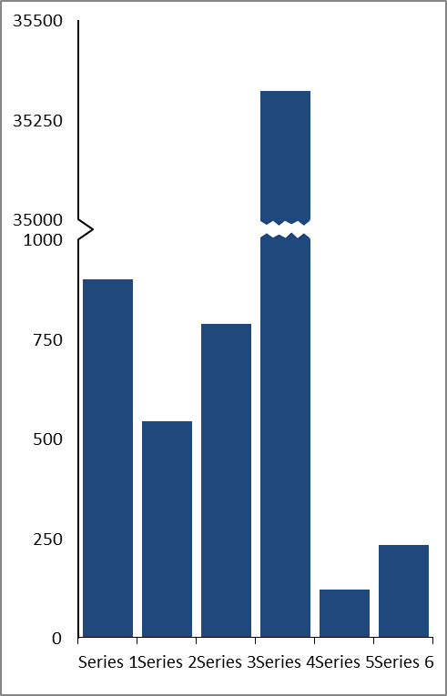
The first thing we need to do is work out where the different groups of data lie. We have one group of data that ranges from 100 to 900. Series 4 on the other hand is just over 35,000. So how could we display that data to get clarity? We need to have a lot of room on the graph between 0 and 1,000 to be able to view the different heights of the columns.
Looking at the data, if we had a chart that had 0, 250, 500, 750, 100, a break, then 35000, 35250 and 35500 as the scale we would be able to see most of the detail clearly. Something like the graph below:
STEP 2 – ORGANISE THE DATA
To do this, we need to do is make some calculations to work out how to draw the chart. We want the break to occur at 1,000 units and restart at 35,000 units. The minimum is zero units and the maximum 35,500 units.

Once this data is entered into excel, we can use the Name Manager to assign these values to formulae. In my worksheet, the value for the break is entered into cell B15. By clicking on this cell, and then clicking on the Name box, we can enter a name. I’ve named this value SPLIT_BREAK_COL.
 I’ve entered similar names for the other values: SPLIT_MIN_COL, SPLIT RESTART_COL, and SPLIT_MAX_COL
Then we can do some calculations. In your worksheet create three new columns: “Before”, “Break”, and “After”. Assuming that your first row of data is in Row three, the “Before” column is column C, and that the “2013” column (the original data) is column B, your calculation in cell C3 should look like this:
=IF(B3>SPLIT_BREAK_COL,SPLIT_BREAK_COL,B3)
This means if the value in cell B3 is greater than the value of the break, then the cell should display the value of the break, if not, the original value. If you copy the formula down the rows, every cell should show the original value except for series 4 which should read 1,000.
In the Break column, the calculation in cell D3 should read something like this:
=IF(B3>SPLIT_BREAK_COL,50,NA())
This means if the value in cell B3 is greater than the value of the break, then the cell should show the value 50, otherwise enter a #N/A value. This value fo “50” will create the “Break” once graphed.
In the After column, your calculation in cell E3 should look like this:
=IF(B3>SPLIT_BREAK_COL,B3-SPLIT_RESTART_COL-1,NA())
This means if the value in cell B3 is greater than the value of the break, then the cell should make a calculation (the original value subtracted by the restart value, otherwise enter a #N/A value. If you copy the formula down the rows, this will create the “remainder of the column. Every cell should show #N/A except for series 4.
The table should now look like this:

STEP 3 – PLOT THE TABLE AS A STACKED COLUMN
First, highlight columns C, D and E and then click on the Insert tab > Column > 2D stacked column.
 Excel will create a chart as shown below:
 Right click on the chart and then click on “Select Data” and click on the “Edit” button to adjust the Horizontal (Category) Axis labels. Use column A as the range.
Delete the legend and gridlines by clicking on them and pressing the delete key.
We now need to format the Before and After series so that they are the same. Click on one of the series and press Ctrl+1 to open the dialog box. You can then change the fill color so that they match.
 Make sure that the plot area fill is white and that the graph has no line (outline).
To create the break, simply insert a white rectangle by clicking on Insert > Shapes > Rectangle. Then create the teeth by adding triangles filled with the same colour as the Before and After series. Group the shapes together:

Then once it is grouped, click on the group to select it and then press Ctrl+C. Click on the break series (red in the chart above) and press Ctrl+V. Your chart should now look like this:

STEP 4 – CALCULATE THE NEW Y AXIS AND SCALE
To show the break Y axis, we will need to create it. This is done by adding an XY scatter line to the graph. First create three new columns: “Labels”, “Xpos” and “Ypos”. Write in the labels you want (see step 1). Leave a blank where the break should be.
Then to create the arrow on the Y Axis where the break will be, we need to fill the Xpos column. I have put zeroes for every label except the break. This will help to create a vertical line with an arrow. I want the arrow to be around a quarter of the size of one of the six series, so I entered a value of 0.25 (assuming my scale will be 0 to 6).
The Ypos values will determine where the labels will lie vertically. In the calculations in Step 2, we determined that the break would be 50 units in value. To begin with the Ypos and the labels will have the same value. This will change when we hit the break. To centralize the arrow we will put the “blank” label as the previous value + 25. The first label after the break will be the blank label value + the other 25. The rest is steps of 250 to match the earlier scale.
I’ve also added calculations to work out the minimum and maximum of the Y scale:

STEP 5 – ADD AN XY SCATTER LINE TO THE CHART
Right click on the chart and choose “Select Data”. Then click on the “Add” button.
Enter “Yaxis” as the Series Name and the Ypos data as the values. In my worksheet that is:
=column!$E$13:$E$21
Press the OK button and then the OK button again. The chart should update as follows:
 Right click on the new series then press Ctrl+1.
In the new menu box that appears, choose to plot the new series on the secondary axis and press the close button. The graph should update again and you should be able to see the new axis on the right hand side of the chart:
 Right click again on the new series and this time choose “Change Series Chart Type”. In the menu box that appears, choose a XY Scatter chart with Straight Lines.
 The chart will again update:
 Right click once more on the chart and choose “Select data”. Choose the Y axis series and press the “edit” button. Add the X axis values (xpos column). In my worksheet this is:
=column!$D$13:$D$21
Then press the OK button and then the OK button again. You will probably be no longer able to see the XY line on your chart. This is because of the scale.
Click on the “Layout” tab in the “Chart Tools” section of the ribbon. Then click on Axes > Secondary Horizontal Axis > Show Default Axis. Your XY line and a new Axis at the top of the screen will appear.

STEP 6 – FORMATTING
First if you haven’t already done so, make the primary vertical (left Y axis) and secondary vertical (right Y) axis match in terms of scale. As you can see in the image above, I’ve given both of mine a minimum of 0 and a maximum of 1550 to match my calculations in step 4. Once this is done you can delete the right hand axis.
Then format the (top) secondary horizontal axis so that the arrow is to one side only. I’ve given mine a scale of 0 to 6.
Then double click the (left hand) primary vertical axis. in the pop up menu that appears, choose to have no major tick marks, no minor tick marks and no axis labels. Click on the line color tab and choose no line and press the close button.

Repeat for the (top) secondary horizontal axis. Your graph should now look like this:

Double click on the XY line and format it to match the colour scheme you have chosen for the X axis. In my case grey with a 1px line. You can do this on the Line Color and Line Style tabs.
STEP 7 – ADD THE XY LABELS
Click on the XY line. Then click on the Layout tab of the Chart Tools section of the ribbon. Then in the labels section, click on Data Labels > Left. You may need to re-position the chart so that the labels can be read clearly:

Unfortunately these are not the labels we want. There are addins that you can buy to give you custom labels. However, it can also be done manually.
Double click on the first data label. Then in the function (fx) bar, type in the cell reference for the label you want to appear. So if I am starting at the top most label (1550), I double click it and then in the function (fx) bar I type:
= C21
Repeat this for each label, including the one in the centre of the arrow, which should update to show a blank label.
Re-position those that are difficult to read by double clicking on them and then with the mouse button held down, dragging them into their new position.
Your graph should now be finished! You can use the same technique with a bar chart as well:

Comments
Post a Comment